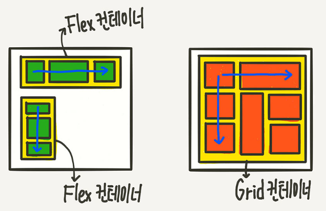
flex 는 한방향 레이아웃 (한방향) 익스 일부 먹음
grid 두방향 레이아웃 (가로 세로 둘다가능) 좀더 복잡한 행렬구조 (표) 구현 가능
익스에서 아예 안먹음
*병합구조에서 사용하기 편하다
grid-template-rows
grid-template-columns (칸의개수)
.container {
	grid-template-columns: 200px 200px 500px;
	/* grid-template-columns: 1fr 1fr 1fr */
	/* grid-template-columns: repeat(3, 1fr) */
	/* grid-template-columns: 200px 1fr */
	/* grid-template-columns: 100px 200px auto */

	grid-template-rows: 200px 200px 500px;
	/* grid-template-rows: 1fr 1fr 1fr */
	/* grid-template-rows: repeat(3, 1fr) */
	/* grid-template-rows: 200px 1fr */
	/* grid-template-rows: 100px 200px auto */
}
1fr
전용 비율단위 사용
columns 칸의 갯수
row 행
% calc 안써도됨
gap
.container {
	gap: 10px 20px;
	/* row-gap: 10px; column-gap: 20px; */
}
행간의 간격 (사이에만 간격이들어감)
.container {
	grid-auto-rows: minmax(100px, auto);
}
가변일떄 auto 사용 행열의 전체크기를 한번에 잡을수 있음
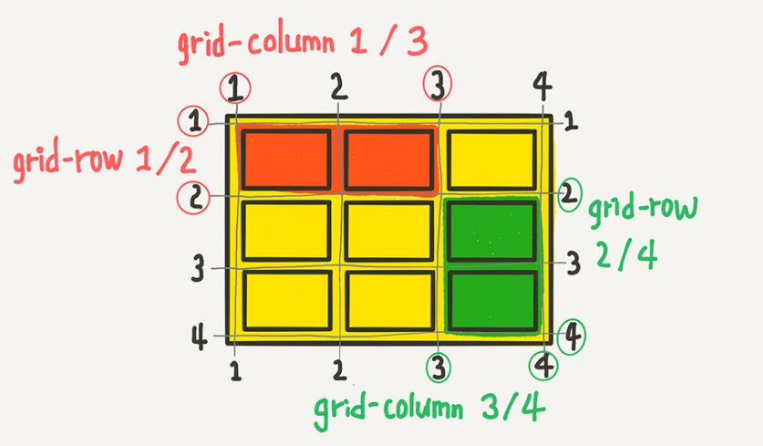
병합
1-3칸을 합쳐라
세로 정렬
.container {
	align-items: stretch;
	/* align-items: start; */
	/* align-items: center; */
	/* align-items: end; */
}
가로정렬
.container {
	justify-items: stretch;
	/* justify-items: start; */
	/* justify-items: center; */
	/* justify-items: end; */
}
itmes 는 개별정렬
content 는 전체정렬
z-index 가능
display: grid;
- IE11에서 사용불가하므로 모바일플젝만 사용가능
- 프론트개발환경(React, Vue)에서 사용가능
- 컨텐츠가 행, 열 구조이며 일부컨텐츠의 크기가 다를경우(복잡)
부모컨테이너 {
display:grid;
/* 여러줄이더라도 한줄인 1fr로 처리가능 */
grid-template-rows: 1fr 1fr 1fr;
/* 3칸으로 지정하고 크기는 동일, fr은 fraction(비율) */
grid-template-columns: 1fr 1fr 1fr;
/* 첫번째칸: 3/5, 두번째칸: 2/5 */
grid-template-columns: 3fr 2fr;
/* 3칸으로하고 가로길이 동일하게 */
grid-template-columns: repeat(3, 1fr);
/* 줄간격, 칸간격, 각 줄과 칸사이만 적용됨 */
gap: 10px 20px;
/* 세로정렬 */
align-items: center;
/* 가로정렬 */
justify-content: center;
}
그리드아이템 {
/* 합치고 싶은 시작번호와 끝번호를 적음 */
grid-row: 1 / 3;
grid-column: 1 / 3;
/* 1번부터 시작하여 두칸 합치기 */
grid-column: 1 / span 2;
/* 1번부터 시작하여 두칸 합침, 시작번호 생략시 1부터 시작 */
grid-column: span 2;
/* z-index, order 사용가능 */
/* 행시작, 열시작, 행끝, 열끝번호 */
grid-area:1 / 2 / 4 / 6;
}
참고 링크
https://studiomeal.com/archives/533
이번에야말로 CSS Grid를 익혀보자
이 포스트에는 실제 코드가 적용된 부분들이 있으므로, 해당 기능을 잘 지원하는 최신 웹 브라우저로 보시는게 좋습니다. (대충 인터넷 익스플로러로만 안보면 된다는 이야기) 이 튜토리얼은 “
studiomeal.com
'CSS🔧 > 반응형' 카테고리의 다른 글
| 모바일 유튜브 비율조절 (0) | 2022.11.16 |
|---|---|
| 아이폰 전화번호/숫자 css 링크 색 변경 (0) | 2022.11.16 |
| 모바일 포인트컬러 주는 방법 (0) | 2022.11.11 |
| 모바일 html,css초기셋팅 (0) | 2022.11.07 |
| 모바일 max-width: 100% (0) | 2022.11.07 |


댓글